Project Summary
AI-driven fraud has made it genuinely difficult to know who you're dealing with, both online and in the physical world. To help individuals and organisations verify identity at high-stake moments (payment requests, contractor access), a Swedish entrepreneur with a team of two developers decided to build a platform called True addressing just that.
While at Block Zero, I led a design effort to crystallise the broad idea behind the True platform into a shippable MVP to prove the product's value to the first investors and users.
Result
MVP shipped
My Role
Discovery & Strategy
Product Design
Project Management
Timeline
Nov 2025 - Jan 2026
Team
Product Designers (2)
Developers (3)

The Challenge
Making the Idea Tangible for Investors & Users
The True team had a strong vision for the future product but needed help translating complex security logic into user-friendly flows, developing a brand identity and building the platform from scratch.
The app needed to reach the MVP stage and be ready for the first users and the first round of fundings within two months from the project's start.
Discovery & Strategy
Defining What to Build
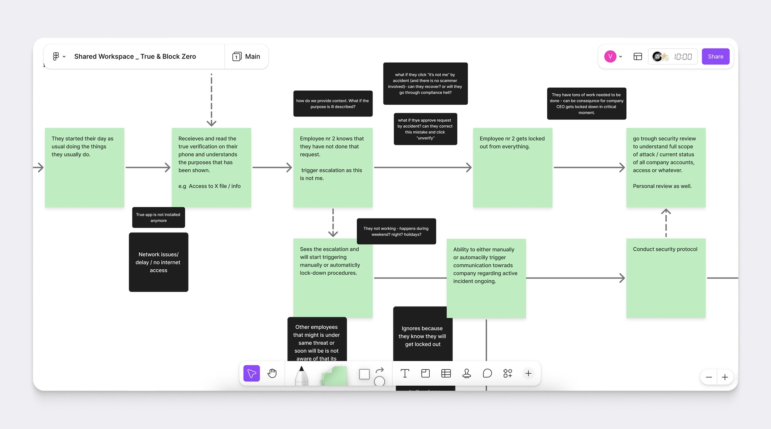
The broad idea behind the product was to allow organisations and private individuals to verify identity of people they interact with online and offline to protect themselves from AI-driven fraud. The True team had features in mind and how to build them, but what stood out to me was a lack of user's perspective and contexts behind their thinking, and a lack of prioritisation for the two-month long timeline as well.
To address the gap, I organised a Discovery & Alignment workshop — mapping realistic scenarios and surfacing the UX nuances that weren't obvious from the idea alone. For example, what if a user receiving payment request denies by accident, should the sender's account necessarily be blocked right away? How much leeway does the UX provide for recovery in such security-intense contexts?
Mapping real scenarios stress-tested the founding team's assumptions and also naturally surfaced what was feasible to design and build within two months and what would prove the most value to future investors.
Mapping User Scenarios and Flagging Critical Moments for the UX
Design Production
Tradeoffs & Design Decisions
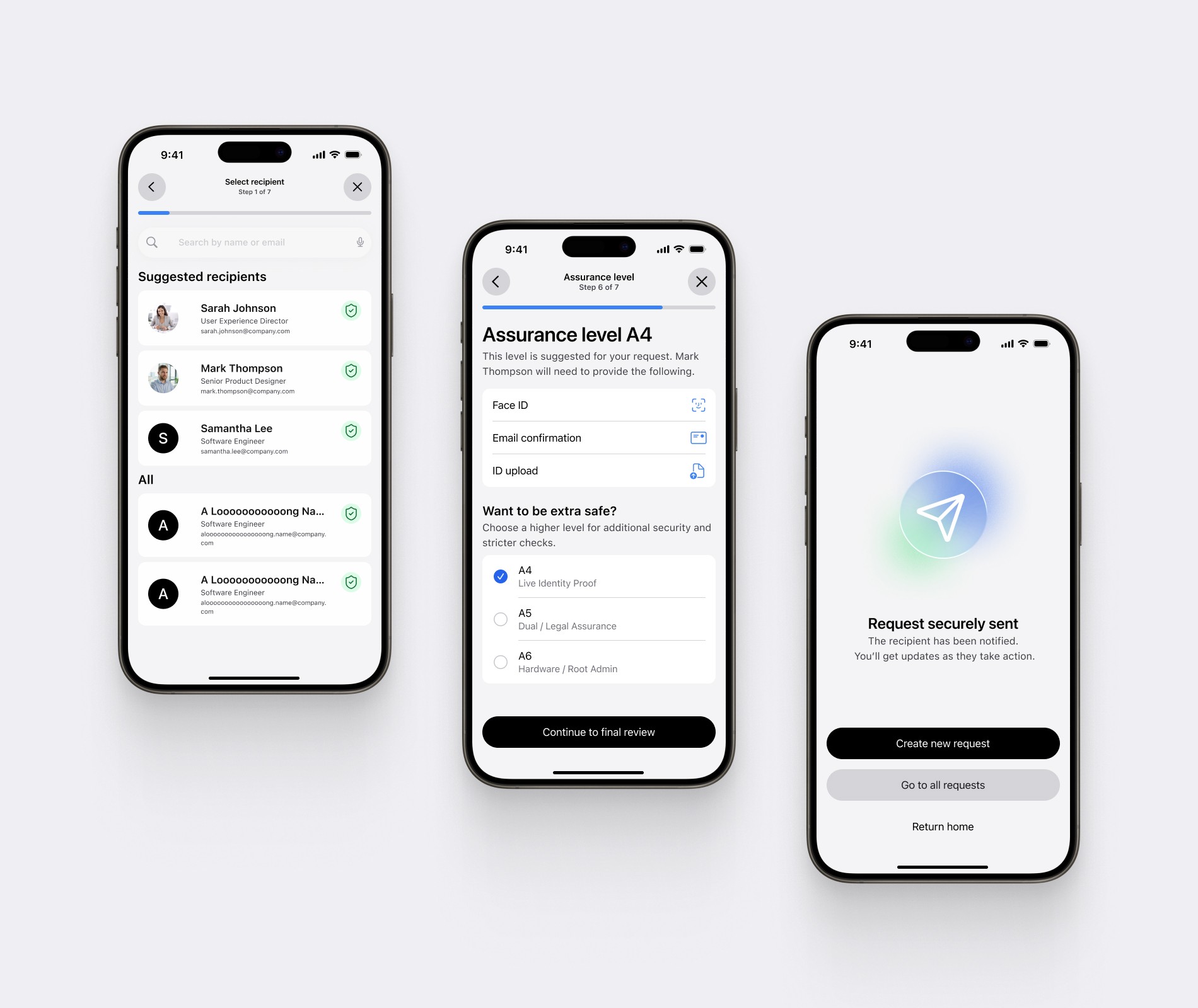
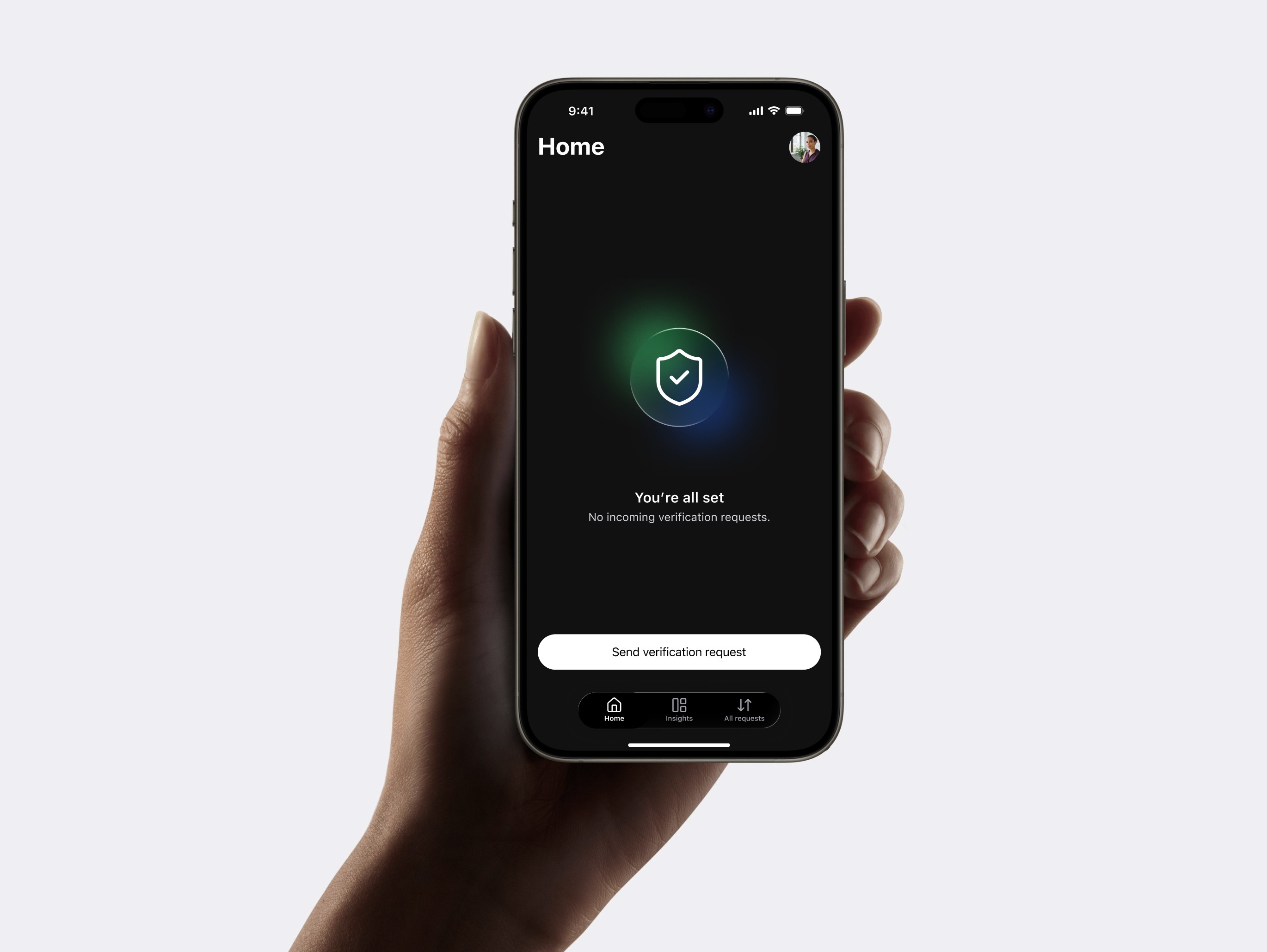
With scope defined, we started designing three user flows: onboarding, sending a verification request, and receiving one.
The visual language needed to convey the seriousness of what True addresses without triggering stress, so we landed on calm, restrained tones, uncluttered UI, re-assuring tone of voice — all to support clarity and focus when users take important actions.
Rather than building a custom UI from scratch and putting more work on developers downstream, we leaned on the iOS and Android design systems and created a lightweight layer of custom components that supported specific actions in the app. This decision indirectly helped the product to both feel native and have a distinct identity for True.
My product design colleague and I worked fluidly across all streams (wireframes, visual language, and design system) looping in developers and the founder throughout rather than at fixed review stages. This kind of cross-pollination helps catch misalignments early and produces more solid results.
Snippets form sending a verification request flow
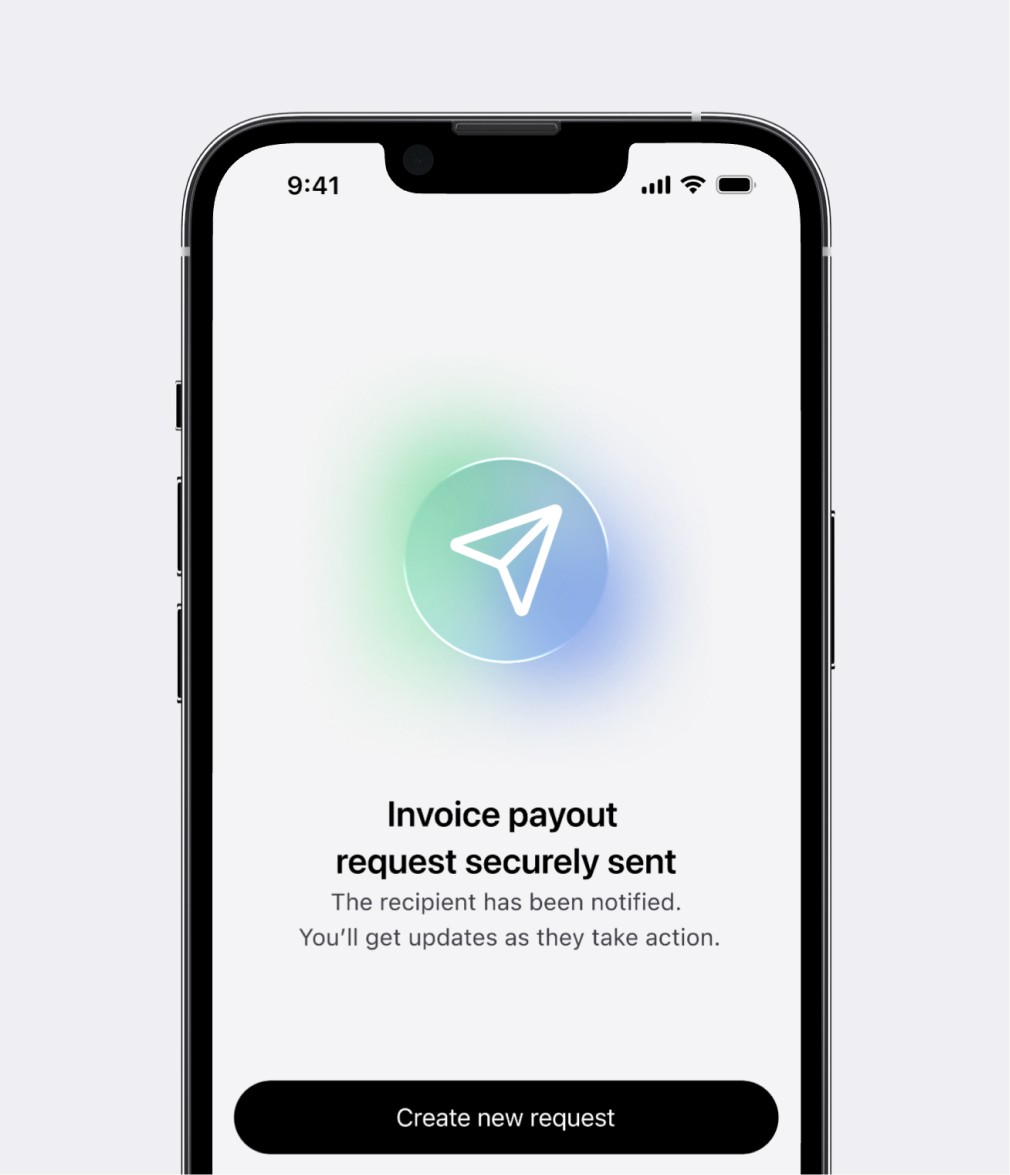
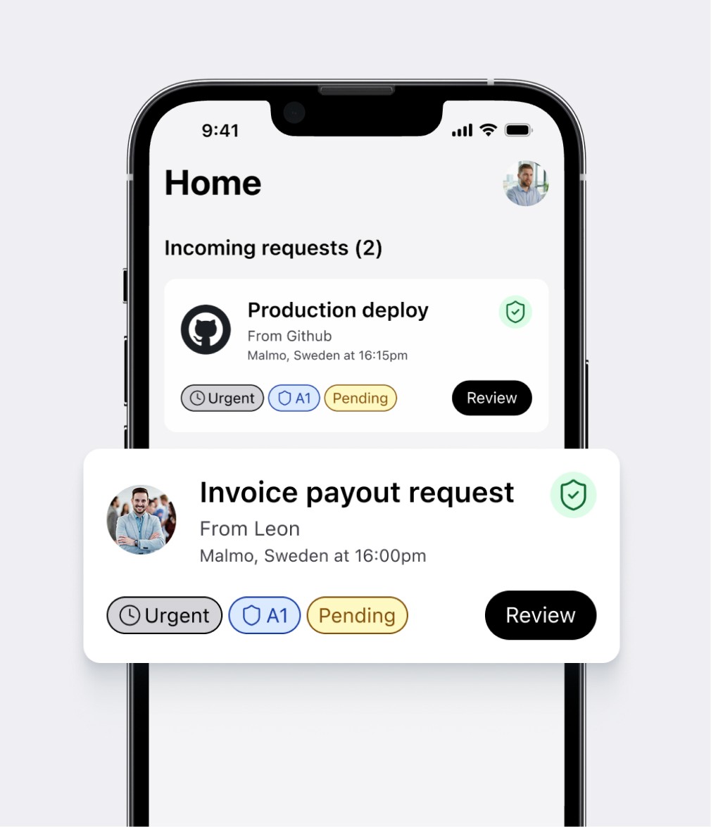
Sending & receiving the payout request
Dark mode support came naturally: the foundational design system I built as an internal studio project had it baked in from the start. Adapting it for True added visual polish without adding timeline.
Result
Shipping the MVP
We delivered a complete, testable MVP within the two-month timeline — covering onboarding, verification request flows, design system foundation and a brand identity ready for public-facing use. The product gave the True team a tangible, investor-ready artefact to take into their first funding conversations.
Beyond the deliverables, the project established a design foundation scalable enough to grow with the product.
Learnings
Letting Go of the Ideal Process
I'm a strong advocate for user testing, but this project was a reminder that it isn't always the right tool for the moment. I decided to let go of the ideal process in favour of the most fitting one to our context: with a two-month timeline and an early-stage product, we leaned on foundational UX principles and the alignment work done upfront instead.
The result was good enough to ship, good enough to impress investors, and good enough to put in front of real users.
Like What You See?
See More in Work & Blog