Project Summary
At Block Zero, I led the creation of a shared design system template to give the team a strong foundation in the beginning of each project. The template standardized variables, naming, and components, so that our design team could save time, become more aligned and effecient at dev handoffs.
Results
Design System Template
Role
Design Ops
Design System Lead
Timeline
May - Jun 2025
Team
Developer
UX/UI Designer (myself✌️)

Business Challenge
The Hidden Time & Energy Sink in Our Workflow
At Block Zero, our small team of six designers and two developers worked across a wide range of projects, from quick landing pages to full product platforms. Despite the variety, each project always started the same way: setting up UI foundations, variables, naming conventions, and a few basic components. And every designer did this in their own way.
It meant hours of duplicate work at the start of every project. Despite spending time on this work, it was easy to break consistency of namings and styles usage when iterating on designs: it wasn’t uncommon to see a “Body” text style where the final HTML should probably have been H4. By the time projects reached developer handoff, the pressure to deliver left little room to clean things up.
For our two developers, who supported multiple projects in parallel, this created even more friction. They had to follow inconsistencies not just within a single file but across multiple clients. The result was a constant time and energy sink: for us, for them, and ultimately for clients.
It became clear that we needed a shared foundation, a design system template that would remove the repetitive setup, establish best practices around file organization, and align designers and developers from the start.
Process
Kick-off Workshop: Co-Creating the System’s Backbone
At the start, I ran a workshop with our team to understand what should be covered in the template. We mapped the kinds of projects we handled, from the smallest website to the most complex platform, and listed the elements that kept reappearing across them. Developers added their perspective too: e.g., on how long component names should be, what existing frameworks we might borrow the structure from, and which design habits made implementation harder than it needed to be.
The Agreed Scope of the Template
After the workshop, we agreed on the backbone of our template. The vision was to allow every designer to duplicate the template at the start of a project, swap values in the variables to fit the brand, and immediately start designing with a solid foundation. Over time, as new components were created, they could be brought back into the shared template, turning it into a living system.
During the following two months, I researched the best practices around existing design systems (thanks, Claude), built our system template and synced regularly with our dev and design teams.
Structure & Content of the Design System Template
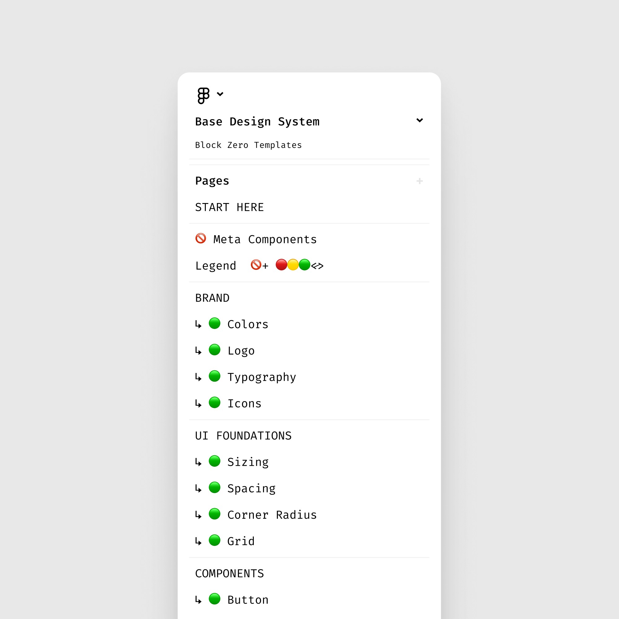

Result
Structure & Content
The result is the template with the following content & structure:
Variables are at the core of the template:
Primitive tokens like base scales and color scales;
Semantic tokens for spacing, sizing, borders, and role-based colors;
Theming to support light and dark modes, or different visual languages
Brand assets, such as logo variations & usage, text styles, icon library, grids, are also included as a baseline.
Starter set of components, each with documentation on how it was built and how to use it.
Finally, the system would come with its own documentation, “meta” components, legends and guides that explained the logic behind the system, and also to give developers a clear reference during handoff.
A System that Works, But Keeps Evolving
The result was a template that gave us speed and consistency: developers reported less time wasted chasing down mismatched styles, and designers no longer had to reinvent the basics for every project. Instead, we could spend that time on actual creative work.
Snippets From the System


Learnings & Next Steps
Balancing Simplicity vs. Complexity
During the process of building the system, I noticed the tension between simplicity and usefulness. If I make the template too generic and simple, it won’t help guide anyone’s design decisions. If I make it too detailed, it becomes intimidating and too specific to be used broadly.
So, the first version of the template became a bit too complex and not beginner-friendly. My written instructions alone weren’t enough; onboarding required live guidance.
That tension remains my biggest learning and is still filling our backlog of tasks related to maintenance of our design system template. However, it’s a natural process: a design system is never “finished”, because it must evolve (not just in terms of tokens and components, but in how it supports the people who use it).
Like What You See?
See More in Work & Blog